How to coax a palette out of your existing wardrobe;
Identifying your primary colors;
Ideas for using your palette to create new outfits;
Tips for using accent colors in unexpected ways;
Using your palette when you shop!
Once you’ve created your palette based on the clothes already in your closet, carry it with you when you shop! (Click the photo to go straight to my article. Photo is my own, also used in the published article.)
This post appeared originally at my A Musing blog, here.
Click on the dots above to visit my mother ship, Colormusing.com, where you can also sign up to receive Hue News, Colormusing’s own monthly e-mail newsletter!
This is the biggest newsflash item I’ve had the pleasure to post about so far: I’m actually creating my dream of a color-centric business, by combining several different areas of interest under a single name:Yes! Knittique (yarns, knitwear patterns, samples, & jewelry), Photo/Graphic Design (art on canvas, tutorials, & graphic files), and The Bratelier (lingerie sewing kits) are now all part of the Colormusing family— a reunion of sorts, where all the various relatives play together nicely because they all have one thing in common: color palettes. Continue reading →
Talk about Changing Your Clothes! It’s interesting that all these looks are from the middle of each decade– I find the biggest fashion changes tend to happen near the ends.
I love this video of 100 Years of American fashion in under 2 minutes!
My favorites are the 20s, 30s, and 70s. Things got weird in the 80s, and then just cringe-worthy in the early aughts. Raise your hand if you had a closet full of polyester lingerie camis and coordinating shrugs. [Head down, hand up.]
Found in my inbox this morning: A slideshow from Refinery29* that suggests we can find our individual fashion identities in one of these categories:
Editor Off-duty
Club Kid Nouveau
Les Sportifs
The New Bohemians
Lady Hypebeast
I’m curious: When reading through this list, is there one (or more) that immediately strikes a chord before you go to the slideshow? If so, that’s a really good indication of the general direction of your personal style. For me, Editor Off-duty and The New Bohemians sound the most like me, but I think I’ll look at the slideshow before I decide.
Am I more Editor Off-duty or…
…a New Bohemian? Or both?
While it’s tempting to go for simplicity and claim just one of these categories as your own, keep in mind that it’s almost impossible to sum up your personal style under a single heading. When I first looked through this slideshow, I found myself wishing that I could just say I’m this or I’m that, and be done with it (certainly would simplify shopping!), but we’re all more complex than that. I really do like putting together outfits that combine modern structure with a slightly quirky side, rather than adopting one look head-to-toe. So, based on this slideshow, I’d call myself Editor Off-duty meets The New Bohemians.
To be honest, even saying that makes me want to rebel just a little and say, “But there’s more to me than that! What about gym clothes? What about tango ensembles??” This made me go back and look through the list of styles in the slideshow once again, but this time with this goal: Put together an outfit with 1 element from each of the 5 types. What do you think? Can it be done?
Tip: I noticed that for each type, there is a suggestion for a jacket, top, pants/dress/skirt, bag, shoes, and an accessory (bag, sunnies)— key elements for creating a complete look— so that’s what I did in the photo below. (It’s interesting that, when you think of these individual pieces in terms of the clothing category they belong to, you start to see the method in the make-an-outfit madness.)
Here’s what I came up with. (By the way, this is something I’d actually wear. Okay, maybe I’d modify those shoes just a bit.)
All 5 fashion types, together in 1 outfit! Editor Off-Duty trousers, Club Kid Nouveau shoe, Les Sportifs top, The New Bohemians bag, and Lady Hypebeast ear cuff. Ta-dah! (Click on the photo to go to the beginning of the Refinery29 slideshow. And speaking of photos, all clothing photos are from the slideshow; I put some together myself to make this image.)
Personally, I much prefer this kind of mix-and-match approach. By this I mean mixing styles; the only “matching” I really ever do is coordinating colors, and the easiest way I’ve found to do that is by creating color palettes for my outfits. In this outfit, for example, the multicolor bag pulls together the red and blue, with the white shoe and gold ear cuff functioning as neutrals.
While it’s certainly possible to dress consistently in just one style, I believe it’s easier to be true to who you are if you give yourself more options; otherwise, there is always the danger of becoming stuck in a style rut (or worse, looking like you’re wearing a costume). The style approach I find the most modern is to start with the general style you feel most comfortable with for your key wardrobe pieces, then add smaller pieces and accessories from a different style perspective.
I’m curious (again): What type(s) do you most identify with? Maybe you consider yourself to be in a category not represented in the slideshow. Are you a one-look-head-to-toe kind of person, or do you like to mix it up— or both?
*The usual disclaimer: I’m not affiliated in any way with Refinery29; I’m just an e-mail subscriber who really enjoys the fashion headlines/advice/inspiration they send me.
I’ve written several posts already about dyeing clothes, and more recently, about dyeing yarn. Now I want to focus on a process that has become increasingly intriguing to me: overdyeing!
What, you ask, is this overdyeing of which I speak? It’s simply dyeing something that has already been dyed. Yep, that’s it. So if you’ve dyed your blue jeans (or not so much blue as dirty-wash ones like mine, below), you’ve done an overdye job! Today’s post will focus mainly on overdyeing yarn, but all the basic concepts apply equally to garments.*
Remember this?
Here’s a rundown of my process:
1. Ask yourself: Do I love the color it already is? If no, and if it’s not a dark color already, it’s an overdye candidate. (If yes, put that garment on right now and enjoy it!)
Tip: It may sound incredibly obvious, but the lighter your garment’s original color is, the more options you have, color-wise, for overdyeing. If it’s a dark color, any overdyeing you do will have a more subtle result; this can be really amazing, e.g. overdyeing navy blue with black, but still subtle.
2. Ask yourself: What color do I want it to be?
Tip: So far, in my dyeing experience, I’d say you’ll get the most predictable results by dyeing your garment in a darker shade of its original color. Example: The pale pink jacket I’m getting ready to overdye* is going to become (I hope) an ombré of deep red to medium-deep pink—staying in the same color family as the original hue.
3. Make an educated guess about the dye color you’ll need in order to achieve this new color.
Tip: You’ll have to take the original color into account, because it will blend with your dye color to create a unique new hue (unless your garment starts out white, in which case, technically, you’re dyeing, not overdyeing). For example, if you start with a pale blue shirt, and you want it to be a deep plum color, adding dark red dye to the blue shirt may get better results than purple dye. (For some color theory basics, see this post.)
4. Gather your materials: garment, test garment or fabric swatches, dye.
Tip: Other items needed for dyeing will be listed on your dye package, and will vary according to the fiber content of the fabric you’re dyeing; vinegar, for example, is generally needed when dyeing wool.
Another tip: There are a lot of factors to take into account, such as the fiber content, that can (and most likely will) affect your results. Ideally, you’d experiment with fabric swatches, but this is not always possible; an alternative would be to pick up a thrift-shop garment in the same fiber and color as your overdye-candidate garment, and use the inexpensive version to test your color theory. This part of the process has the added advantage of familiarizing yourself with the dye process itself, which gives you confidence to move on to dyeing your original garment.
5. Dye!
Tip: Again, très obvious: you really do need to follow the dye instructions very carefully, especially regarding safety. The Rit dye company has some useful tutorials here, and they also have a PDF with over 500 color recipes here!
How about some examples of overdyeing yarn? Yes, let’s do that. In my short but colorful history with dyeing yarn, I’ve had some amazing successes, but also some experiences ranging from “meh, I’m just not crazy about the color” to epic failures (one of these is coming soon to a blog post near you). Thankfully, unless you’ve dyed your yarn black, it’s almost always possible to give your ugly yarn a new life! To wit:
My very first overdye experience was with this merino/cashmere blend. The minty-green is not bad, it just looked a bit… flat.
Mint yarn before overdyeing. On the right is the yarn after it was completely dry, showing how much lighter results can be than when the yarn is in the dye bath. (I had used the yogurt container to rinse measuring spoons, my gloves, etc., so the color of this water was constantly changing. For some reason, I thought I’d see what would happen if I dunked some yarn in it. Et voilà.)
Here, I dipped the mint yarn into a fairly diluted deep purple, hoping for something close to lavender.
After the lavender dip. At left, I’m dipping most of the mint skein in the purple dye, using a clear paintbrush to hold the top of the skein; I deliberately kept this little part of the skein out of the dye, which resulted in the brighter minty spots in the finished skein (right).
Tip: This project gave me my first inkling of the transparent nature of dyes; if you look really closely at the finished overdyed skein (above, at right), you can see a little of the original mint green peeking through the lavender, giving the skein an overall watercolor-y character that I love. P.S. If you want all the sexy details about this particular skein (and my other yarns), they’re here in my Etsy shop.
Finally, a very recent example: the Emerald skeins I was dyeing for this month’s Birthstone Collection yarns. This was interesting. I dyed a skein of mohair/wool/nylon at the same time as a skein of 100% nylon ribbon (nylon and animal fibers both use the same kind of dye), and got quite different results, as shown in these swatches:
Emerald swatches. The nylon ribbon (left) took the dye as I had hoped, but the mohair blend (right) looks like solid green, with a few turquoise-y spots. What’s a dyer to do?
Fortunately, the mohair skein was large enough to divide into 3 good-sized skeins. So I took 2 of these incredibly green skeins and overdyed each in a separate bath, hoping to achieve an ombré color sequence between the 3 skeins (I decided to leave 1 skein as it was after the first go-round). Here’s the result:
Ombré Emerald mohair set of skeins. Skein 1 is the color from the original dye process; Skein 2 was overdyed with turquoise and sapphire blues, and Skein 3 resulted from the addition of a deeper blue and a little black. Success! (You can find this yarn in my Etsy shop here, and the ribbon yarn is here.)
Again, most garments that you dye will actually be overdyed (unless they start out white), so even though my examples focus mainly on overdyeing yarn, the same general process still applies to dyeing clothes. Once you get over your normal, basic fear of permanently ruining whatever you’re dyeing, I think you’ll really enjoy the process of changing your clothes with overdyeing— and the one-of-a-kind results!
* I have a pale pink cotton eyelet trench coat that I’ve had for years, but which needs a facelift (is that face lift?), so that’s next on my overdyeing project/post list. Okay, that might be after I dye some more yarn. Stay tuned!
Strictly speaking, this isn’t about clothes, but it is about dyeing, which I’ve already been writing about here (and which applies to some of my changing-clothes posts). It’s also related to my current book proposal project, focusing primarily on the palette-dye recipe-dyeing yarn process— I’d love to have your feedback!
After I started hand-dyeing my own line of yarns in January (you can read about this here), I decided it was the perfect time to start creating skeins inspired by the birthstone of each month. Here are my birthstone skeins so far. (Click on any photo to go to that yarn in my Etsy shop.)
Garnet, January’s birthstone, followed by Amethyst (February) and Aquamarine (March):
My Garnet hand-painted colorway, shown here in Aussi (100% Australian merino wool).
Garnet in Buttery Thick (100% alpaca).
Garnet in Ticklish (100% nylon novelty flag yarn).
Amethyst in Softy (80% merino wool/20% cashmere).
Amethyst in Ticklish (100% nylon).
Aquamarine in Ticklish (100% nylon).
Aquamarine in Airy (100% alpaca).
Aside: Each of these sets of skeins was hand-painted with the exact same dyes; can you see how each of the different fibers absorbs the dyes differently? This is just one of the many…
There are the fun surprises, like finding that shocking-pink cashmere V-neck I’d thought I’d accidentally thrown away during a houseguests-are-coming organizational frenzy. Then there are some less pleasant surprises, such as a broken zipper on the skirt that would have been the perfect thing to wear out dancing or the jeans that don’t quite fit any more. And every once in a while, something simply serendipitous (not to mention alliterative!) takes you by surprise, usually when you think you have things all planned out, but then the plan changes…
The other day, I went to the library in search of books about dyeing (please note the crucial letter e in that word). Specifically, I was looking for useful information about dyeing yarns with acid dyes (I touched on my adventures in Dye-land recently). I’m working on a book proposal on this topic, so I naturally wanted to see what’s already out there. Since I had already done extensive online searching, including scans of library databases, I wasn’t totally surprised at the meager results: less than a dozen books grouped in the dyeing category, and almost all of them focused on (a) dyeing fabric, primarily cotton fabrics for quilting (which requires a different type of dye), and/or (b) using natural dyes. (Of course, it could be that books that would meet my criteria were all checked out, but I checked on the library computer before I left, and this was not the case.)
However, it’s virtually impossible for me to leave any library empty-handed, so I looked around the color/art section and found…
…this!
The Color Scheme Bible, my latest library find. (Image courtesy of Amazon.com; click the picture to see this book at Amazon.com.)
Yes, I know it says it’s about interior design, but if you look, you’ll find that most color palette-oriented materials available do seem to be for interiors. But that doesn’t mean you can’t put them to use in your closet! In fact, the following experiment may just inspire you to try new color combinations with the clothes and accessories you already have, not to mention the way you choose new items to add to your current wardrobe. Try it!
Here’s what I did.
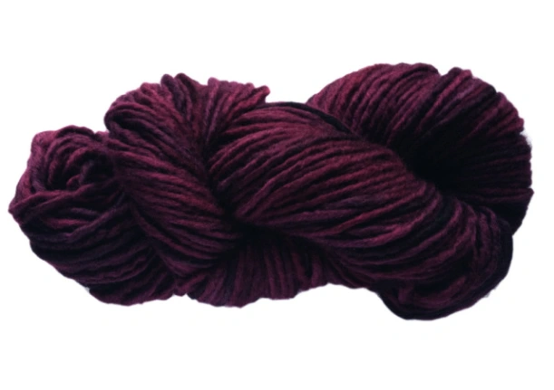
Step 1. I skimmed through the pages of palettes (organized into sections by color families: pink, grey, blue, etc.), settling on this one that jumped out at me:
Step 1: Pick-a-Palette! I chose this one primarily because I know I already have several things in my closet in the main color (bordeaux, although they’re calling it damson berry). I love the general idea of wearing several different shades of red together, so this seemed like a good place to start.
Tip: Make sure your palette has a minimum of 3 colors: main color, secondary color (often a contrast to the main color), accent color. A simple, high-contrast wardrobe example would be a black skirt (main color), white blouse (secondary color), hot pink heels (accent color). If your palette has more than 3 colors, like the one shown here, you’ll have that many more options, particularly with your accessory colors.
Step 2: Start with something in your main color. I found this skirt. (This should be a garment, not an accessory.)
Step 2: Main-color garment: Bordeaux skirt.
Tip: When laying out your garments, it helps to put them on top of a white sheet so you can judge the color effects without distractions. (This is especially helpful when I’m laying things out on my bed— it’s covered with a deep claret-red comforter.)
Step 3: Add a secondary-color piece. An ensemble is not made with a skirt alone, so I pulled this be-sequinned espresso-brown tank:
Step 3: Top that skirt! This is the closest match I could find to the darker secondary color (top left on the book page), which they’re calling “eggplant”. This deep brown looks pretty close to me.
Already I have an outfit of pieces that I hadn’t previously thought to combine!
Step 4: Add another secondary-color piece. I wanted to find something in bright pink (the other secondary color in my palette), if possible:
Step 4: Add pink! Hand-knitted capelet, combining bordeaux shades with both light and bright pinks. Also note the difference made by adding multiple new textures to this outfit. Layering also makes it more versatile.
Notice how with each additional step, I’m actually creating a new look? And all based around the same skirt, and all done with things I already have!
Step 5: Add accent colors. I’m so intrigued with the sort of deep chartreuse and bright turquoise accent colors in my palette, neither of which I would have thought of pairing with bordeaux. I’m not so sure I have anything in those exact shades, but this sweater comes kind of close to the chartreuse:
Step 5: Acc-ent-uate the palette! With the addition of the chartreuse cashmere pullover, this outfit suddenly feels totally different. Okay, I’m not sure this particular sweater works wonderfully with the style of the skirt, but the point is to start to visualize new color combinations, right?
Step 6: Add another accent color, this time with accessories, that is, if I can find anything in my closet that’s reasonably close to turquoise. How about this green bag? It’s kind of in the same color family. I think. Ooh, and this turquoise scarf!
Step 6: Adding accessories. The scarf comes closer than the bag to the palette’s accent colors, but this exercise is not really about rigorously matching colors; it’s just about playing with colors. (The scarf is one I hand-knitted with some luscious merino/cashmere yarn that I dyed to create this ombré effect; the scarf is made with just 1 skein. Here’s where you can find this yarn in my Etsy shop.)
Step 7: Add finishing touches. I’m going to put a favorite sweater-jacket in a deep rose-red over this outfit and see what happens!
Step 7: Finish with a jacket! To my eye, at least, this ensemble suddenly looks much more cohesive. Again, the color of my jacket doesn’t exactly match anything in the palette, but it works. And the felted wool adds another textural surprise!
Tip: Looking at this last photo makes me realize that it’s a great example of the use of complementary colors, in this case, red and green (and various shades thereof). Remember my color theory crash course? Complementary colors are opposite each other on the color wheel—the origin of many a fine color palette.
Step 7, Part Deux: Try a different accessory color. Just by switching the turquoise scarf for one in shades of pink and red (also one of my own hand-painted yarns), this look changes yet again. And this time, the red/green complementary color thing is even more apparent:
Step 7, Part Deux: The Big Scarf Switch! Changing to this subtly-variegated scarf makes a crucial difference with all these solid colors. And for me, considering all the different textures I now have in the outfit, this combination works the best, color-wise; it’s just shades of red and shades of green. Simple!
Looking at these photos again now, it really still amazes me that I could, in a matter of minutes (less if I hadn’t been taking these photos!), pull together an interesting outfit in a color combination I hadn’t thought to try before now. Quelle surprise, indeed!
Find a color palette that speaks to you, then take it into your closet. I’m betting you’ll be surprised by what you find!
I’d love to know what happens when you try this! If you want to get started right now (you know you do), browse palettes on ColourLovers. The link will take you to my page there, but you can search through the whole site; for example, when I searched for “bordeaux”, these are the palettes that came up.
Yes, folks, as promised, here’s a fun little color theory crash course, cleverly disguised as a book review of sorts. What book, you ask? Why, it’s “Color”, by Betty Edwards (the acclaimed author of “The New Drawing on the Right Side of the Brain”). Okay, this seems like a pretty generic title for such a massive subject, so it’s subtitled “A Course in Mastering the Art of Mixing Colors”. Yes. That’s so much better.
“Color” by Betty Edwards. Yes, the subtitle suggests that this book is geared towards art students, but stay with me— it does connect to your clothes! Click on the picture to see this book on Amazon.com
To back up for just a minute, last month, I started hand-dyeing and painting yarns for the first time, which I started writing about in this recent post (lots more to come on that in future posts). And a funny thing happened almost immediately: I realized how little I actually know about color! Sure, I’ve been producing a line of color-sequencing yarns* based on my own color concepts for over 10 years, and focusing on color-palette creation more recently, but when it came to actually mixing dyes in an attempt to create unique colors, it took me maybe 5 minutes to figure out that I needed more information. That’s when I found this book.
“Color” is written primarily for artists, yes, so most of the exercises are relative to painting. However, there is so much information about color itself that I found the book not only incredibly helpful in terms of basic color theory, but that it also greatly increases my awareness of, and appreciation for, the use of color in actual artwork. But for purposes of this post, I’m focusing on the color theory. I hope you’ll find it as beneficial as I have!
I did promise this would be a crash course, not a treatise, so I’ll make this as brief as possible, starting with a classic color wheel:
Color wheel. Isn’t it pretty? Courtesy of Northlite.net. Click the wheel to see it on their website.
You’re most likely already familiar with the color concepts presented on the wheel: Primary, Secondary, and Tertiary colors. Personally, I thought I had a handle on this, but some specific details gave me new insights. For example, I was aware that each secondary color (green, orange, violet) is a combination of 2 of the 3 primary colors (red, blue, yellow), but I didn’t know that the tertiary colors (the hyphenated ones) are each a combination of a primary and a secondary color. And for dye-mixing purposes, believe me, this is quite a revelation, as you’ll see.
Tip: When I was just looking around for a good color wheel image, I was startled (and somewhat confused) by the enormous range of wheel styles. My advice is to stick with the basic 12-color wheel; it’s really all you need.
Now that we’ve absorbed the color wheel concepts, let’s move on to the 3 main attributes of a given color: hue, value, and intensity.
Just for fun, let’s use Pantone’s 2014 Color of the Year, Radiant Orchid, as our example:
Radiant Orchid. Can you name its hue, value, and intensity? (I couldn’t, before reading Betty’s book.) Click on the picture to find this fab flash drive at Pantone.
Hue refers to the color family your color belongs to; to determine this, find the color on the wheel that you think is closest to Radiant Orchid. I’m thinking Red-Violet.
Value refers to the relative lightness or darkness of a color: white is at one end of this scale, black at the other. Radiant Orchid looks like it’s slightly on the medium-dark side.
Intensity (also known as saturation or brightness) refers to a scale that goes from bright to dull. A fluorescent color, for example, would definitely be at the bright end, while a smoky shade would be closer to the dull end. Our Radiant Orchid looks like it belongs on the brighter (but not brightest) end.
Tip: If you have worked in Photoshop or another photo-editing application, you’re probably familiar with the term “desaturation”; if an image is completely desaturated, there’s no color at all— it’s greyscale. So you can think of colors on the dull end of the intensity scale as having grey added to them, replacing color. In dyeing, as with mixing paints, adding a bit of the complementary color—the one exactly opposite on the color wheel—also dulls the intensity, but without changing the original hue.
So Radiant Orchid can also be described as medium-dark, medium-bright red-violet. Ta-dah!
Okay. I realize this is still just theory. How does it apply to my dyeing projects? Well, since I’m determined to mix my own colors from primary dye colors (as opposed to using pre-mixed “fashion” colors), this is of tremendous help to me in planning which primaries to mix together. For Radiant Orchid, I’ll no doubt have to experiment to get an exact match, but I’d say that starting with red and blue, with a higher proportion of red (to make the hue red-violet), in a solution that’s not very diluted (so the value stays medium-dark), and possibly with a touch of yellow-green (red-violet’s complement) to slightly dull the intensity.
And what about dyeing your clothes? Well, assuming you’re starting with something other than a pure white garment, technically what you’ll be doing is over-dyeing, that is, adding color to an existing color, as I did with my jeans in one of my early dyeing projects on CYC. So if you’re starting with light-blue denim, which is already on the dull side of the intensity scale, you may want to dye it with a bright shade, which will take on some of the qualities of the original denim color (fiber dyes are essentially transparent); if you used, for instance, a bright shade of green dye, your results will most likely be an interesting blue-green hybrid, but your jeans will probably not be as bright as the dye color itself.
Honestly, now that I’ve learned about color hue, value, and intensity, I feel so much better prepared for my dyeing experiments; instead of just throwing colors together and waiting to see what happens, I have a solid basis with which to predict the results. This (I assume) will not only save me time (less experimenting), but also money, for the dyes and the undyed yarns I’m starting with.
I’ll leave you with this liberating thought: you don’t have to ever dye anything to apply these basic color theory principles to your wardrobe! Simply going into your closet and really looking at the colors that have collected there will give you new insights into the colors you prefer. Dark, light, bright, smoky, neutral, happy? Try to think of words that sum up your colors— then remember them when you’re shopping, dyeing, or otherwise changing your clothes.
*You can find my color-sequencing yarns in the Scraplet Skeins section of my Knittique Etsy shop. (Be sure to look at the color cards to see the entire color sequences in each skein.) And while you’re there, take a look my first hand-painted skeins, in the New! Hand-painted Yarns section.
So funny, but also a great idea– I know I tend to put the same pieces together, rather than mixing them in new ways. Wardrobe Bingo should help us get out of any fashion ruts we may have inadvertently wandered into!
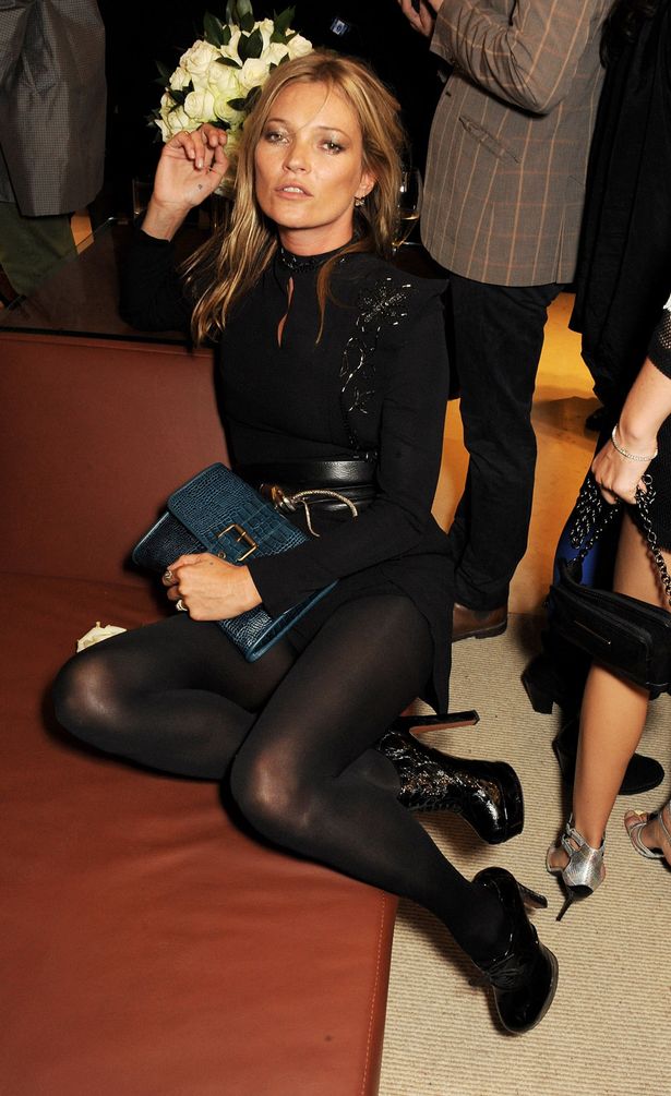
A revised version of bingo helps you plan your outfits!
Transitioning to a new season is always tough, especially for people who live and breathe fashion. New seasons mean new trends to keep up with, new items of clothing to invest in, and new outfits to plan; It can get pretty overwhelming. Luckily, BooHoo.com has come up with a little game of Wardrobe Bingo to help with all that hard work.
It might seem like bingo has no place in the fashion world, being the drab, boring game that senior citizens play in stuffy bingo halls, but the game seems to have sprouted a sense of fashion in recent years. Not only have the most fashionable people of the world started to take up the game (case in point Kate Moss and Catherine Zeta-Jones, unashamed lovers of bingo), but the game itself has started blooming into a colorful experience.
After my unplanned and extended blogging sabbatical, I’m back (!), with a fabulous new project: Dyeing! Yes, you’re right, I’ve written about dyeing my jeans, among other things, but at the risk of using Famous Last Words… this time it’s different.
Aside: Ironically, following my last post (In Re-Covery: The Great Pillow Makeover!), I spent the next several weeks slowly recovering from a serious illness. For a while, I couldn’t even read, let alone write, but when I could, I started studying about the dyeing process, which progressed rapidly into actual experiments, to the extent that I now resemble not so much a color enthusiast as a mad scientist. Think Pantone inadvertently wanders into Dr. Frankenstein’s laboratory. End of aside.
Two of my recently-produced skeins, hand-painted at the same time, with exactly the same colors and heat-processing. The one in front is 100% nylon, and the larger one in back is a mohair/wool/nylon blend*. You can immediately see how differently the fibers absorb the dye; the shininess of the smaller skein also affects the way the colors are perceived, versus the softer, slightly matte effect of the mohair blend. Is it any wonder that I’m so fascinated? (Click on the photo to see these skeins, and lots more, in my Etsy shop.)
How, you ask, is it different? Primarily because now, instead of simply dumping a box of dye into the sink and throwing my hapless jeans into it along with a cavalier, come-what-may attitude, I’ve actually taken some time to learn about the dyeing process. (Great concept, right?) And I think it’s about time I pass what I’m learning on to you, particularly because, as long as I’ve worked with fibers, fabrics, yarns, and colors, most of what I will be sharing with you here is, quite surprisingly, new information to me.
Going back to the beginning of my learning process (less than 4 weeks ago!), the first revelation was about the different types of dyes, and what each type is used for, thus:
Acid dyes
Fiber-reactive dyes
Natural dyes
Union dyes
Note: There are other dye types out there, such as a specialized formula that’s used for leather and other skins, but for now, I’m just going to focus on these 4, since they’re the most widely available for the casual user, and also the most commonly used for fibers, fabrics, clothing, and accessories.
Here are brief summaries what I’ve learned about these four dye types:
Acid dyes. Contrary to what this term conjures up (nightmare visions of caustic chemicals burning skin off my hands, but maybe that’s just me), these dyes do not actually contain acid; acid, usually in the form of either vinegar or citric acid, is added during the dyeing process, which causes the pigment (color) to bond with the fiber. (Also contrary to the implied harshness: when I’ve tested my dye mixtures with pH test strips, I’ve found that they are not any more acidic than your average vinaigrette. Which we eat.) Acid dyes are used to dye protein fibers (animal fibers: wool, alpaca, silk, mohair, angora, camel hair, etc.) and somewhat surprisingly, nylon.
Fiber-reactive dyes. Unlike acid dyes, these dyes require alkalinity to bond pigment to fiber; soda ash is commonly added to the dye bath to accomplish this part of the process. Fiber-reactive dyes are used for plant-based fibers (cotton, linen, rayon, bamboo, etc.).
Natural dyes. Despite the rather benign association we have with the word “natural”, what I’ve read about using natural dyes is that, while the material used for the color (flowers, roots, etc.) may not be harmful in itself, the dyeing process requires use of mordants, which are the fixatives that bond the color to the fiber— and many commonly-used mordants have been taken off the market because of unacceptable toxicity levels. Natural dyes can be used with a wide variety of animal-based and plant-based fibers; the mordants required will vary depending on the fiber.
Union dyes. Rit dyes, along with others commonly found in craft stores these days, are usually union dyes; the term refers to the dye formula containing both acid and fiber-reactive pigments, so you can successfully dye either animal-based or plant-based fibers (or both at the same time); however, if you’re dyeing, say, cotton jeans, the fiber-reactive part of a union dye is the only part that will bond with the cotton fiber, leaving a lot of leftover dye.
Please understand that I’m not trying to encourage or discourage using any of the above types of dyes; I’m simply pointing out that, in order to make an informed decision about what type is appropriate, it’s good to know not only the uses for each, but also the advantages and disadvantages of each. I could probably fill a year’s worth of blog posts just exploring these areas in more depth, relative to all of these four dye types, but for now, I’m going to concentrate on acid dyes***, since that’s what I’ve been using up to this point.
Next time, I’ll plunge into the exciting world o’ color, with maybe a little basic color theory, more about the acid-dye process, and a lot of pretty pictures. Oh, speaking of which, here’s a look at the results of my very first day of dyeing, including lots of mini-skeins, and a few full-size ones:
My first color tests! I’m so glad I decided to start with Superwash wool** mini-skeins (10 yards each) to test the dye colors, including with various levels of dilution. And yes, that is my bathtub. (The full-size skeins, all 100% wool, are now available in my Etsy shop. The red color is called Cardinal; the blue-green ones are Pacific. Click on the photo to see them, along with lots more!)
Coming up on CYC: Because this has become an ongoing research project, you can expect many more posts on the general topic of dyeing here at Changing Your Clothes (and you can also find these posts and much more on my color-centric blog, a Musing). I do think this subject is relevant to CYC, since dyeing is one of the simplest ways to change your clothes. And it certainly can’t hurt to learn more about how your clothes (and the yarns, fabrics, etc., thereof) are produced.
Also, I think I should tell you that the aforementioned future CYC dyeing-related posts will most likely be heavy on the puns. Don’t say I didn’t warn you.
*This lovely mohair/wool/nylon yarn is available (undyed) at Dharma Trading Company. (The link will take you to the listings of all their undyed yarns; this mohair is Yarn #6 Toaga. As of 2/13/14, it says it is temporarily sold out.)
**The Superwash wool yarn I’m using for my mini-skeins is also available (undyed) at Dharma Trading Company. (The link will take you to the listings of all their undyed yarns; this wool is Yarn #39 Kona Worsted.)
***The acid dyes I’m using are also from Dharma Trading Company, their own brand of dyes; their extensive selection also includes other brands. (The link will take you to the page for Dharma’s acid dyes.)